Cape Atlantis Shells Brand Identity
Cape Atlantis Shells LLC · 2024
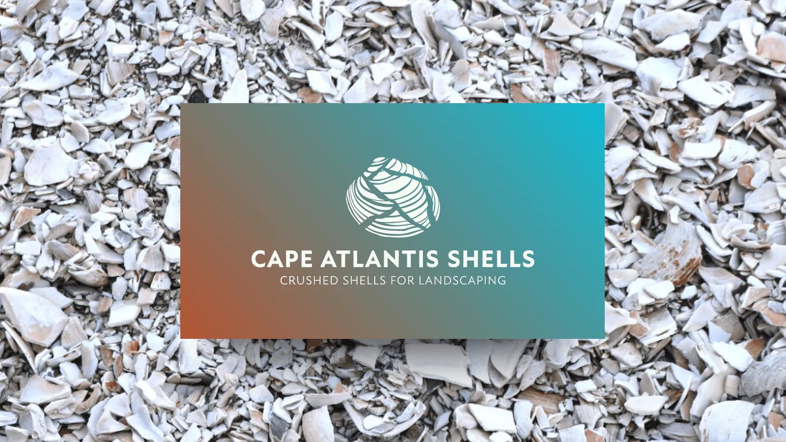
FIG. 01 — Cape Atlantis Shells Brand Identity, branding, 2024
Client
Cape Atlantis Shells LLC
Year
2024
Scope
Identity · Van Decals · Website
Milestone
First Sale
Cape Atlantis Shells sells crushed clamshells as a sustainable alternative to gravel, and had no brand to speak of — nothing to separate it from a generic landscape supplier in Cape May, New Jersey. The founder needed something coastal and environmentally minded without falling into beach clichés, credible enough to hold up in a residential yard and on the back of a work truck.
The Idea
→ The brand sits between landscape supply and coastal lifestyle.
Rather than treating sustainability and curb appeal as separate selling points, the identity brings them together through a visual language rooted in place: natural materials, coastal forms, a sense of craftsmanship.
The name Cape Atlantis provided the starting point. I built the identity on its oceanic character with a shell-and-wave motif — distinctive without becoming literal.
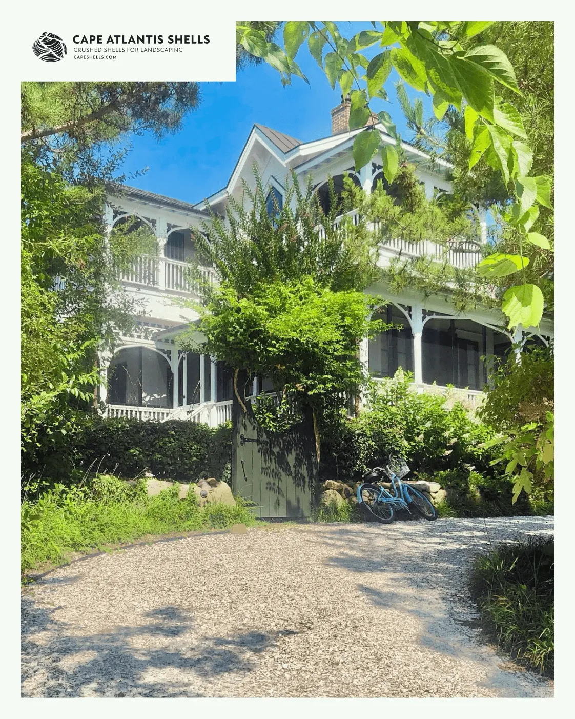
FIG. 02 — Coastal Lifestyle Driveway
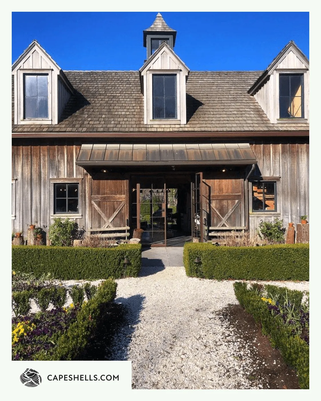
FIG. 03 — Rustic Coastal Barn
The Identity
The system is built around a primary stacked lockup — mark, wordmark, and tagline — for signage, letterhead, and anywhere the brand has room to breathe. A horizontal lockup handles tighter formats: stationery, van doors, web headers. For small-format use — social avatars, packaging, favicons — the mark drops into a circular badge, with the name and URL set in a ring around it.
The system runs on two channels. Digital surfaces — the website, social — carry a gradient running from sea teal to land terracotta, with the mark set in flat white against it. Print and fleet applications use a monochrome version, black on off-white or reversed, for one-color production and consistent reproduction on vinyl and paper.
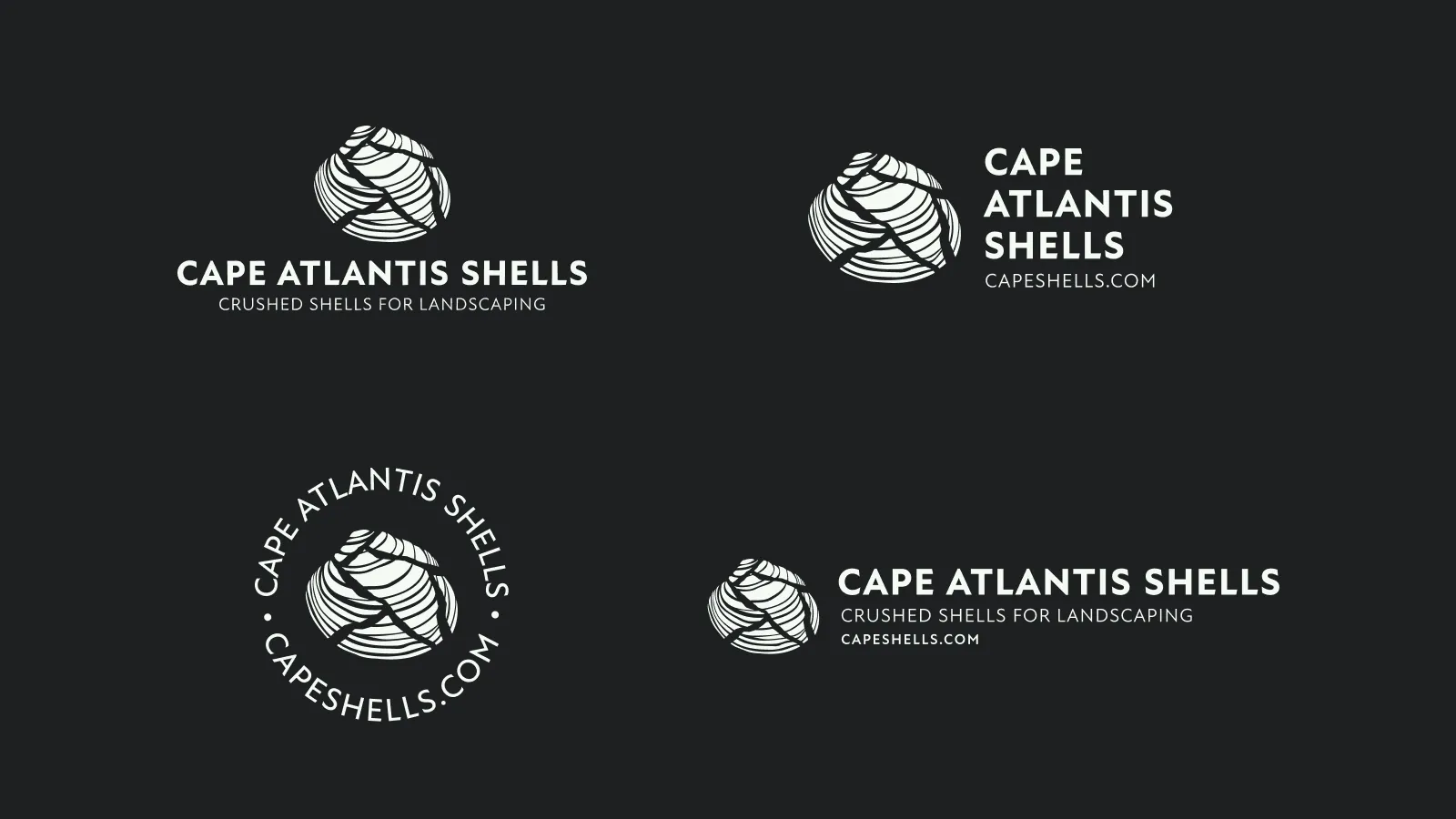
FIG. 04 — Brand Marks
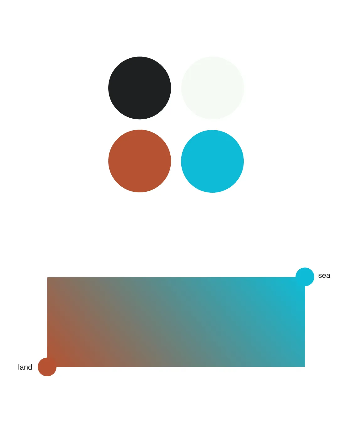
FIG. 05 — Color Palette
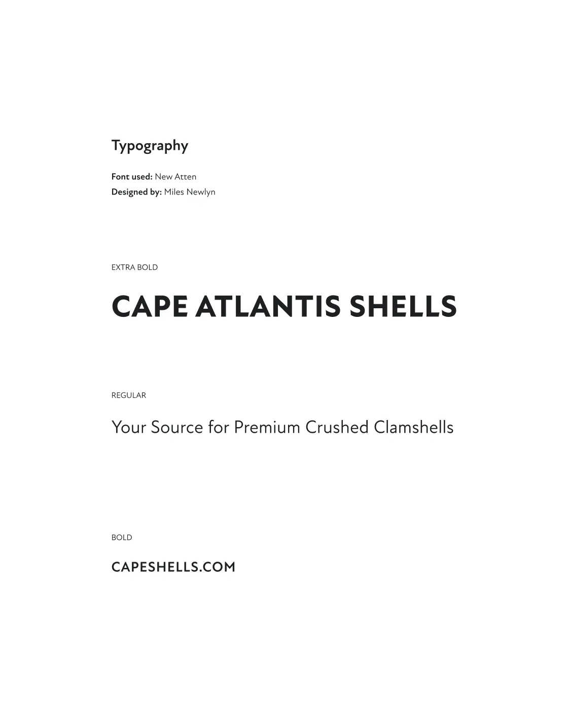
FIG. 06 — Typography
The Van
For a local delivery business, the van is the brand’s most-seen surface by far — rolling through neighborhoods, parked in driveways, sitting outside job sites. I focused the production work on the decal: vector files prepared for print, paired with mockups so both the printer and the client had an accurate preview before anything went to vinyl.
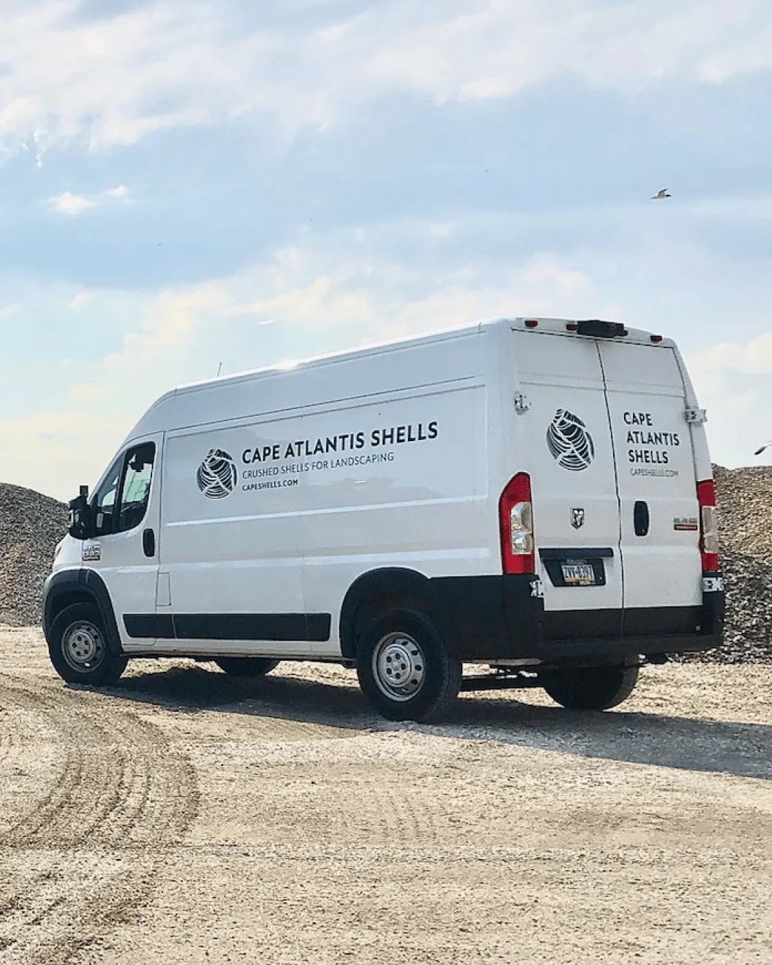
FIG. 07 — Final Production
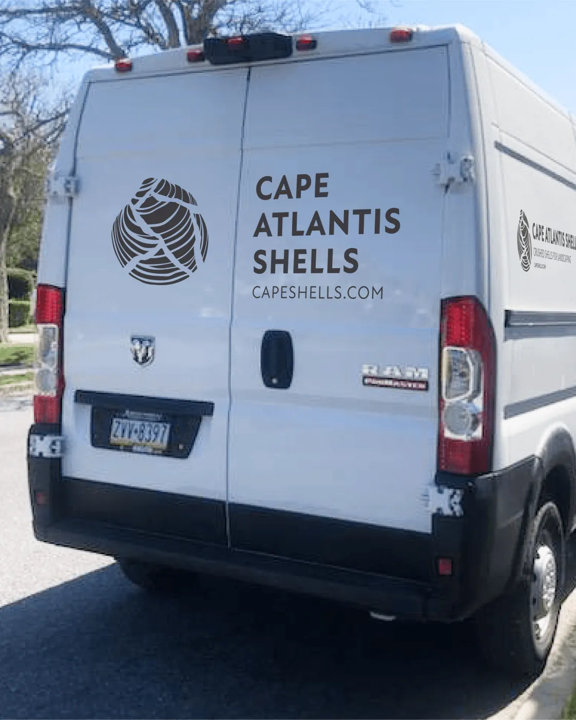
FIG. 08 — Back Close-Up
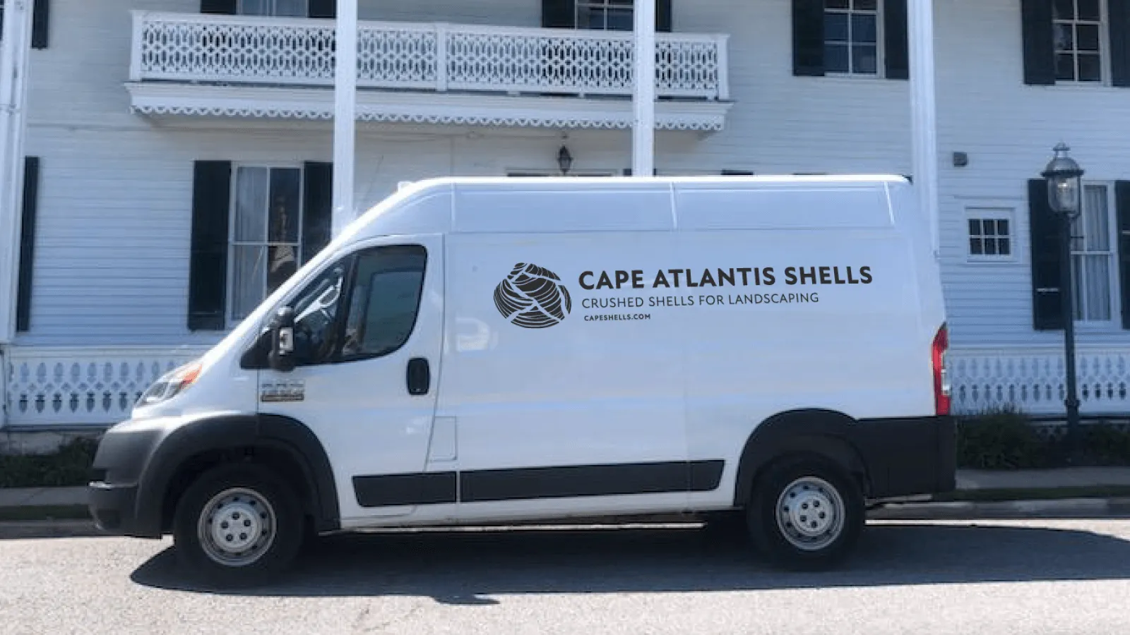
FIG. 09 — Scale & Placement
The Website
The website carries the gradient channel into its most fluid format — full-bleed across the hero, with the mark in flat white to hold contrast against the shifting color underneath.
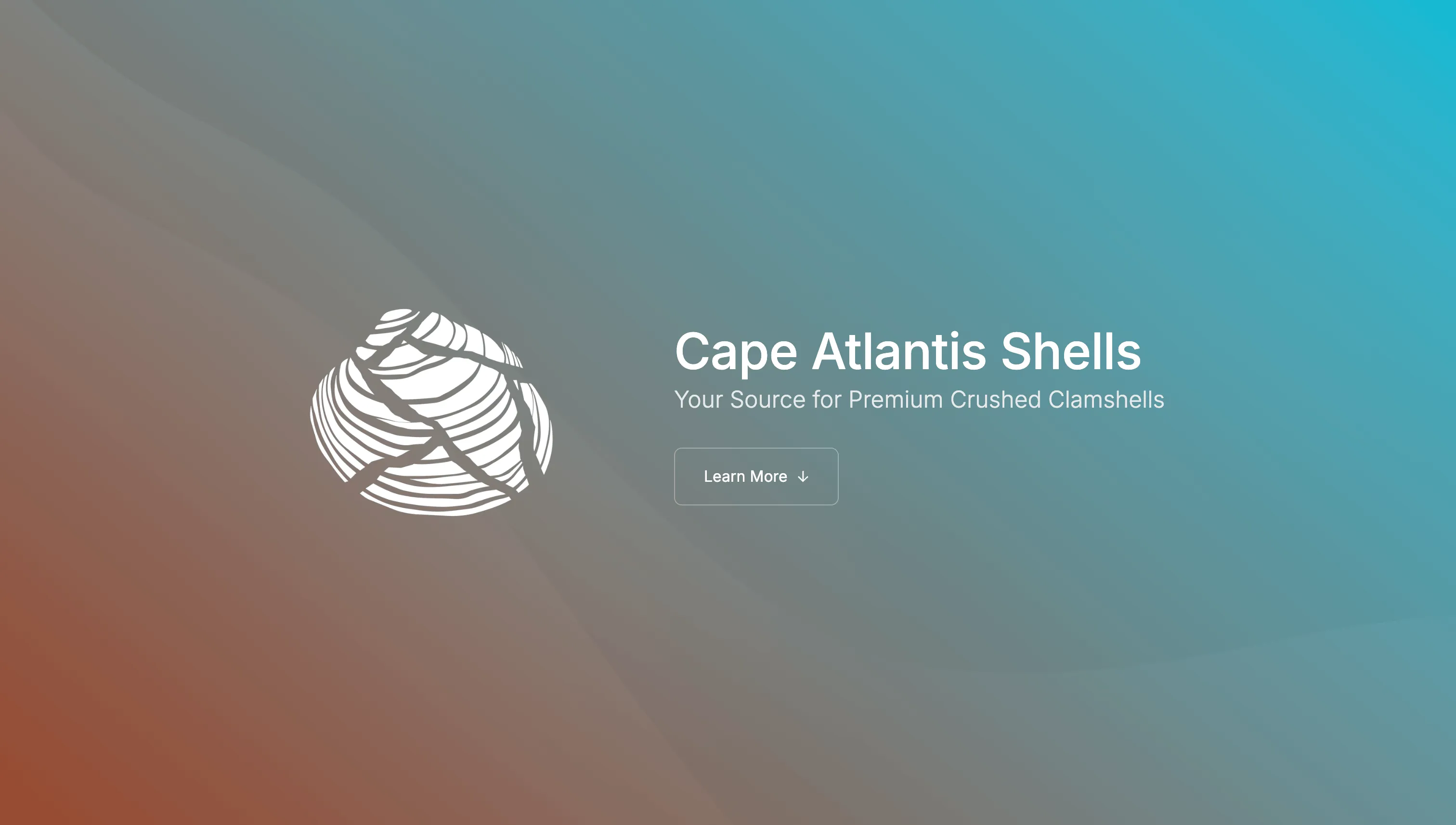
FIG. 10 — Website Hero
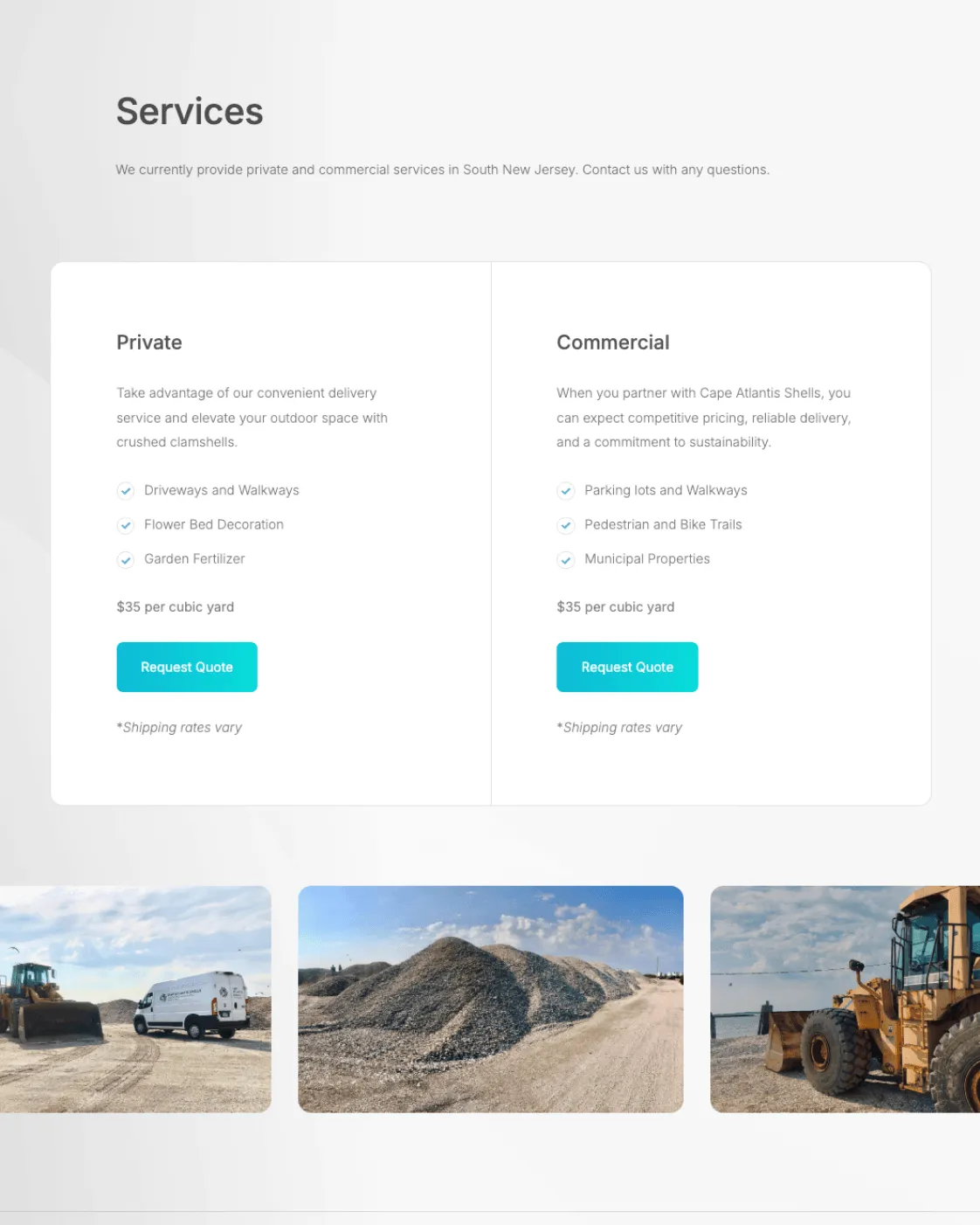
FIG. 11 — Website Services
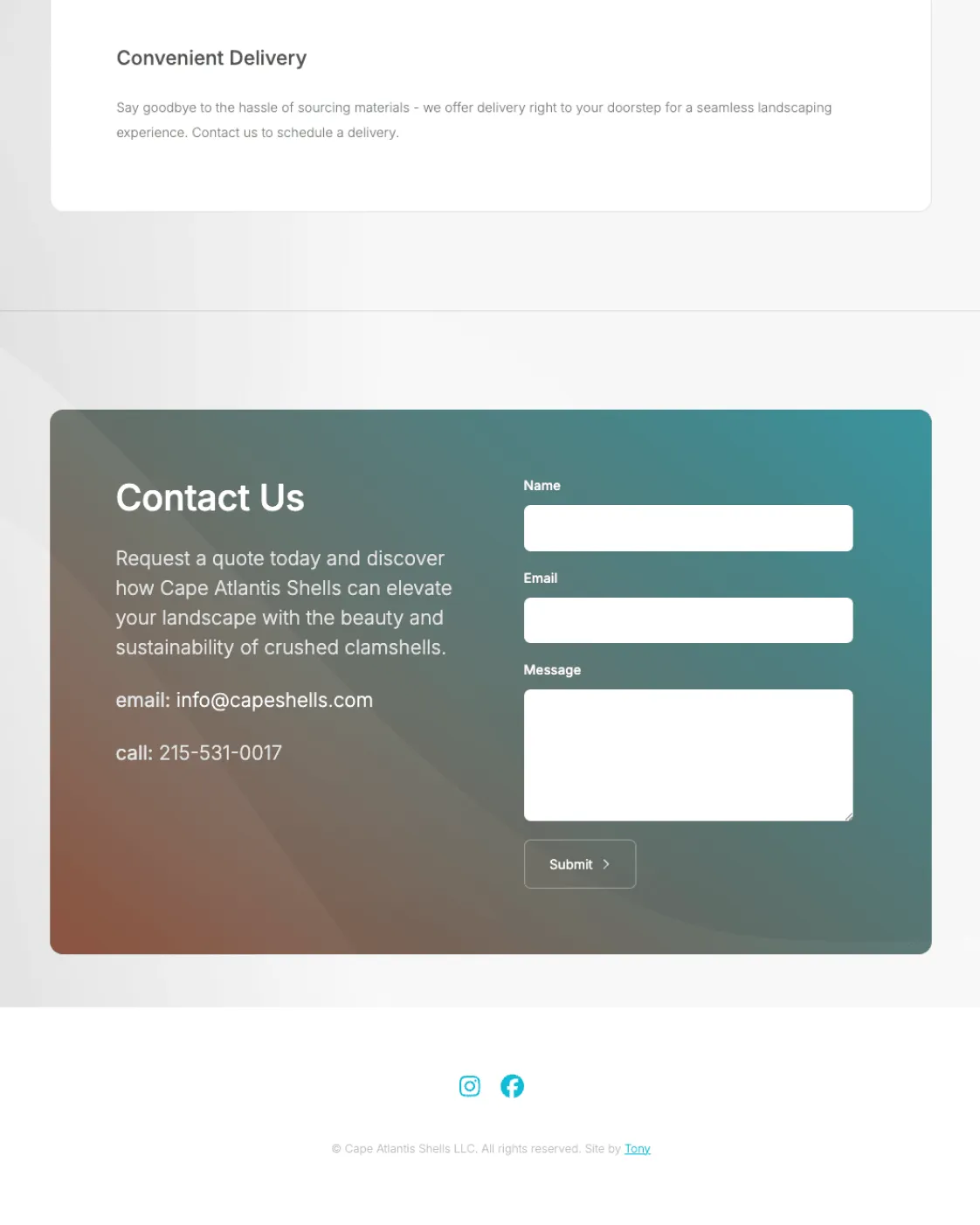
FIG. 12 — Website Contact Form
Branded Assets
- Brand Identity
- Primary, secondary, and tertiary marks, icon, color palette, and typography.
- Brand Applications
- Vehicle decals, business cards, letterhead, and social assets.
- Digital
- Website design, development, and copywriting
“Tony took the chaos in my head and translated it into a brand that actually makes sense to other humans. From early sketches to the site for capeshells.com, he kept everything aligned—product, visuals, messaging—so it feels like one clear, recognizable voice instead of a patchwork of half-finished ideas.”
Chamyang Unkow, Founder, Cape Atlantis Shells
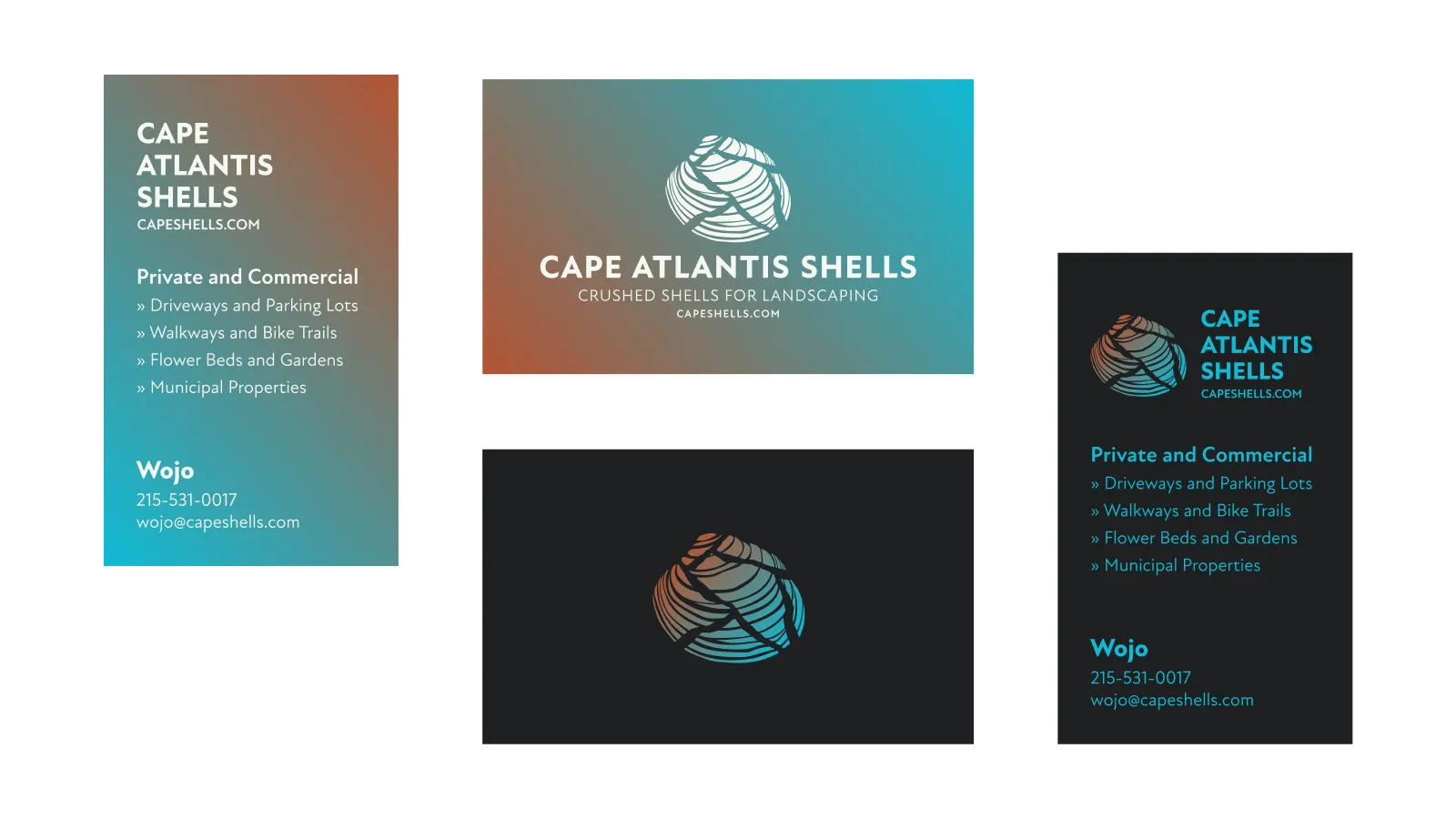
FIG. 13 — Business Cards
The Outcome
Cape Atlantis Shells launched with a system built to hold up everywhere its customers would actually encounter it: a social avatar, a business card, the side of a delivery van moving through a neighborhood. The relationship hasn’t ended at launch — I’m still working with the founder as the business grows into its next round of applications.
Designer, Director, Developer
Tony Voorhees
Founder & Owner
Chamyang Unkow