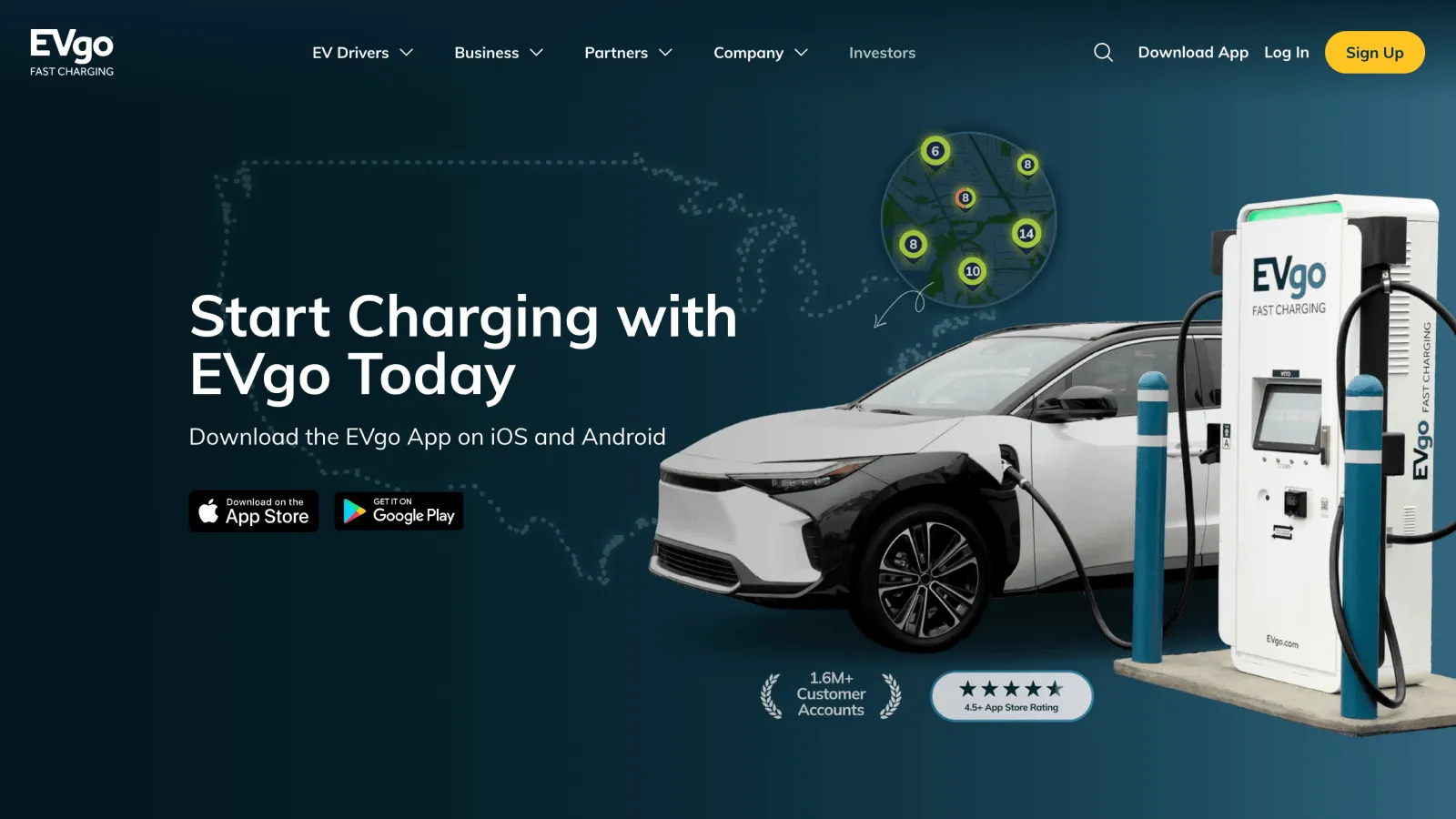
FIG. 01 — EVgo.com Redesign, web, 2022
Client
EVgo
Year
2022
Scope
Product Design · UX/UI · Visual Design · Design Systems
Recognition
From charging network to connected digital experience. A product, brand, and design-system overhaul for one of the country’s largest public EV charging networks.
Impact at a Glance
- +
70+ pages: Redesigned within one unified system.
- +
100+ components: Built once, designed to scale.
- +
35% more new users: Following the redesign.
- +
30% higher conversion: Following launch.
The Challenge
→ EV charging is complicated enough. The experience shouldn’t be.
As EVgo grew, its digital experience expanded with it — adding new products, features, and touchpoints along the way. The challenge was to bring it all back into one coherent experience: a clearer, more connected path through the moments that mattered — from discovering a charger to starting a session, managing an account, and understanding what comes next.
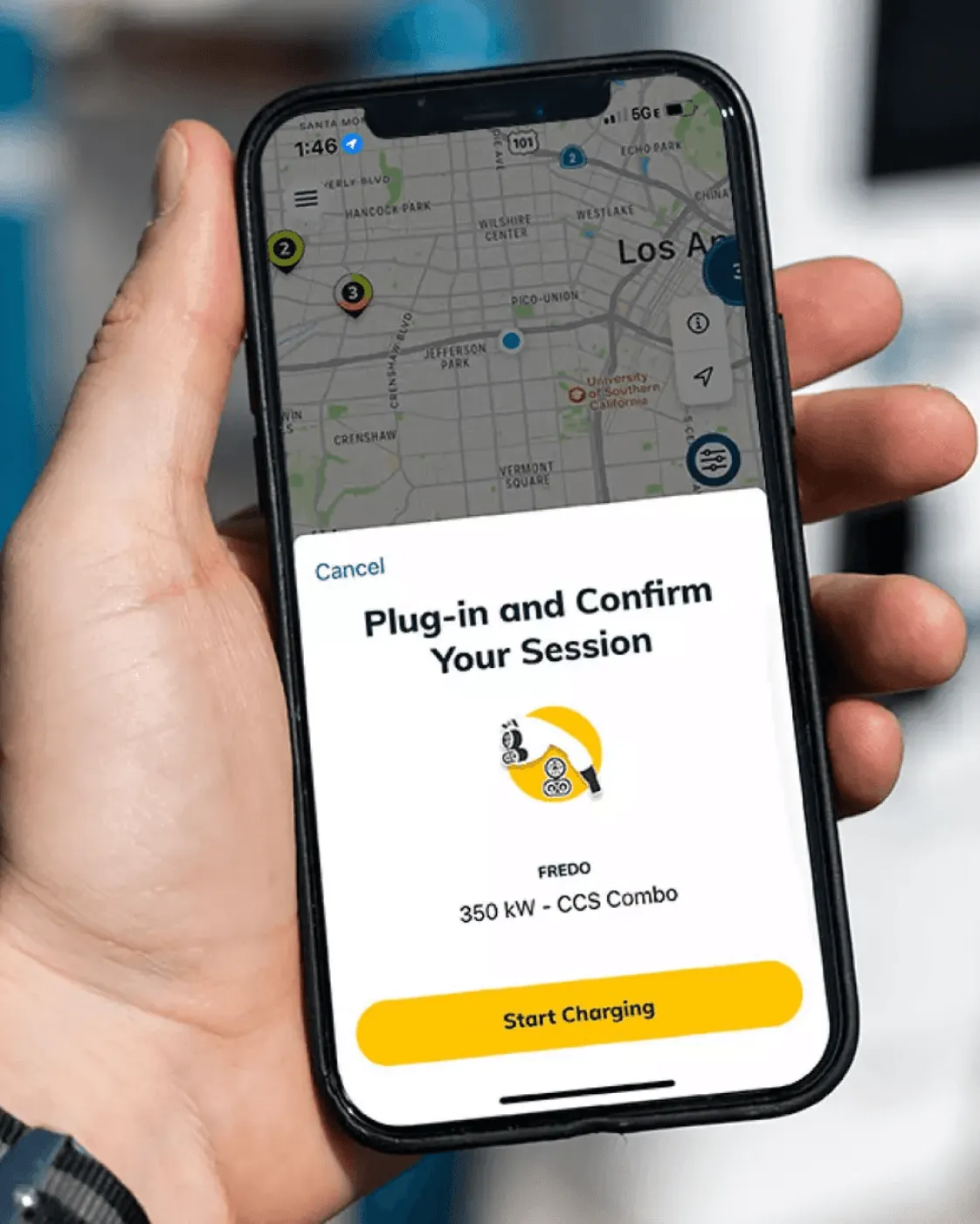
FIG. 02 — EVgo mobile app
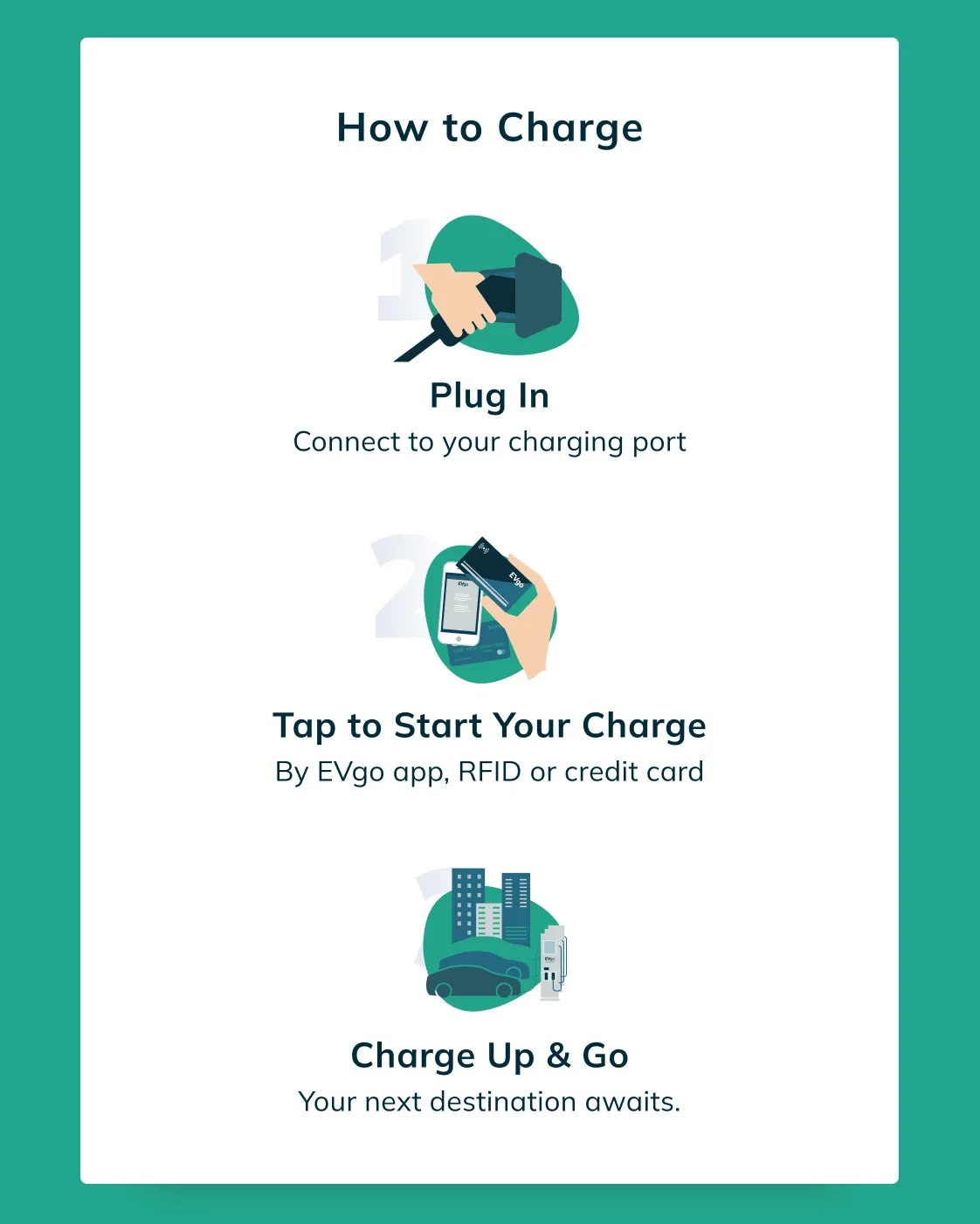
FIG. 03 — How to Charge Sequence
The Role
I led work across product, UX/UI, and visual design, bringing the experience together across multiple surfaces.
That meant moving between strategy and execution: understanding the customer journey, defining patterns, designing interfaces, and building the system that could support them.
→ Product strategy → UX → UI → Design system → Production
The Insight
The experience needed to behave like one product.
A driver doesn’t think in terms of “website,” “app,” “charging network,” or “account management.” They think: Where can I charge? Can I get there? How much will it cost? Can I start charging? What happens next?
That meant the design system couldn’t just make individual screens consistent. It needed to make the experience itself feel connected.
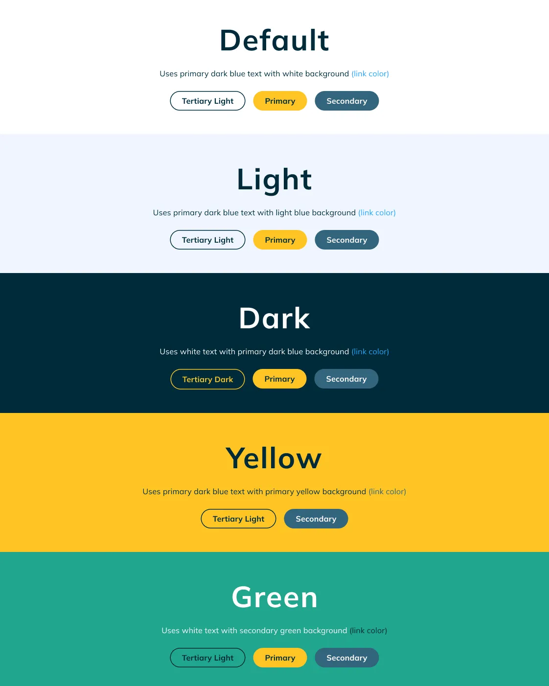
FIG. 04 — Brand Themes for Campaigns
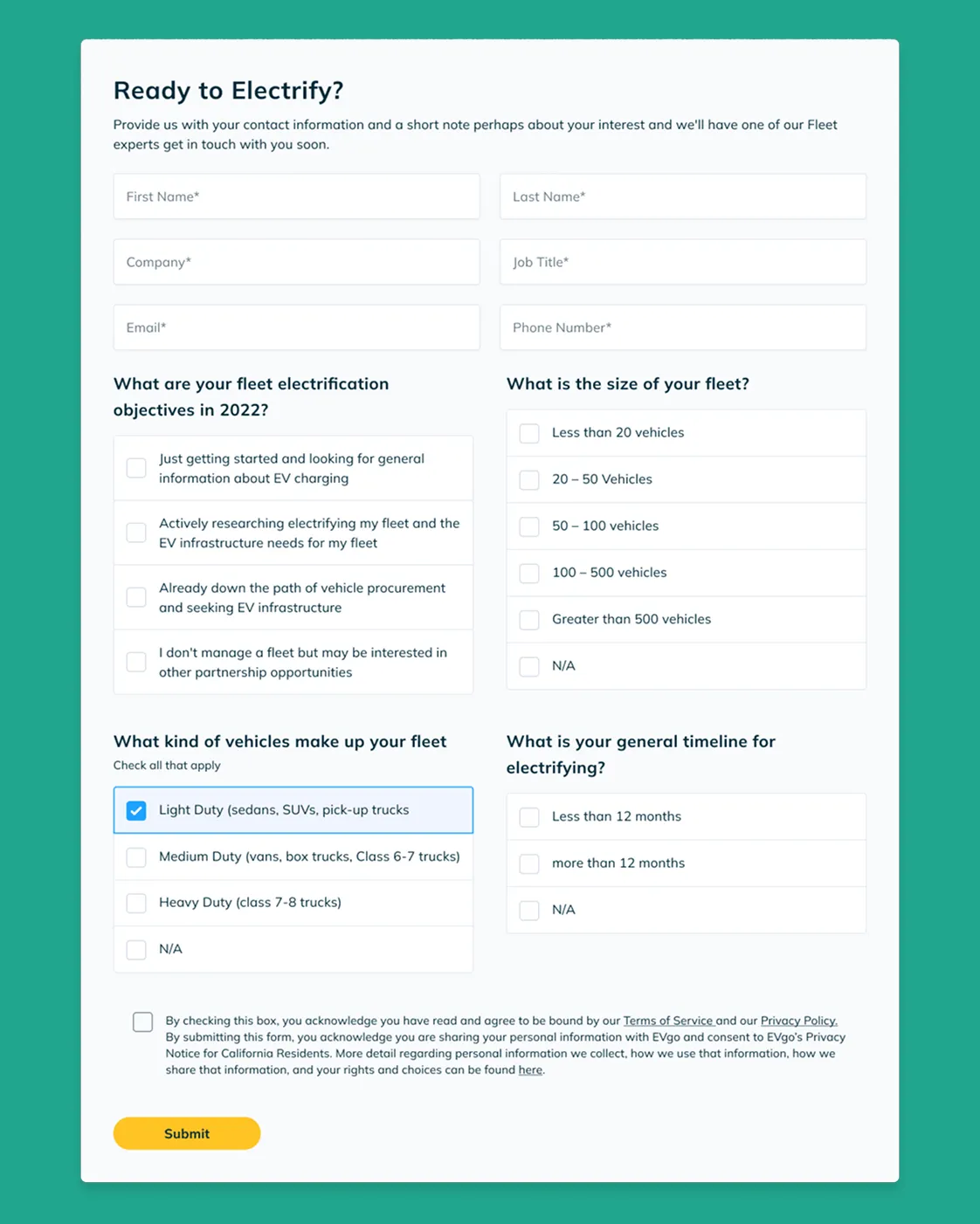
FIG. 05 — Custom Form Builder for Marketing
What Changed
- A clearer path to charging
The website became less about presenting information and more about helping drivers make a decision.
I prioritized the core journey: discover a station, understand availability and pricing, and get moving. Information architecture, navigation, search, station details, and calls to action were redesigned around that path.
Less browsing. More getting somewhere.
- Product and brand started speaking the same language
EVgo's visual identity had to work across marketing pages and functional product experiences.
I carried the same principles across both: typography, color, hierarchy, components, imagery, and interaction patterns. The result was a system that could move from a campaign page to a charging flow without feeling like two different products.
The brand became part of the product — not decoration around it.
- The system became the product
The redesign touched many screens and states, so consistency couldn't rely on individual designers repeatedly making the same decisions.
I developed reusable patterns across navigation, cards, forms, tables, pricing, account experiences, and responsive layouts. The goal wasn't simply a component library, but a shared visual and interaction language that could scale with the product.
- Designed for the real world
EV charging doesn't happen at a desk.
Drivers interact with the experience while navigating, standing at a station, checking a charger, managing a session, or planning their next stop.
That changed how we prioritized information. The interface had to be clear at a glance, resilient across screen sizes, and focused on the decision immediately in front of the driver.
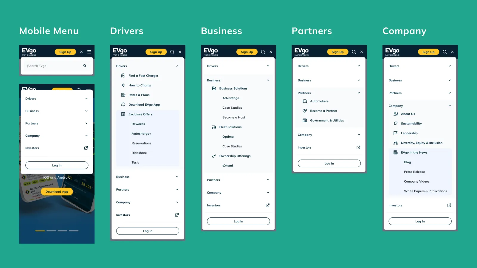
FIG. 06 — Redesigned Mobile Navigation
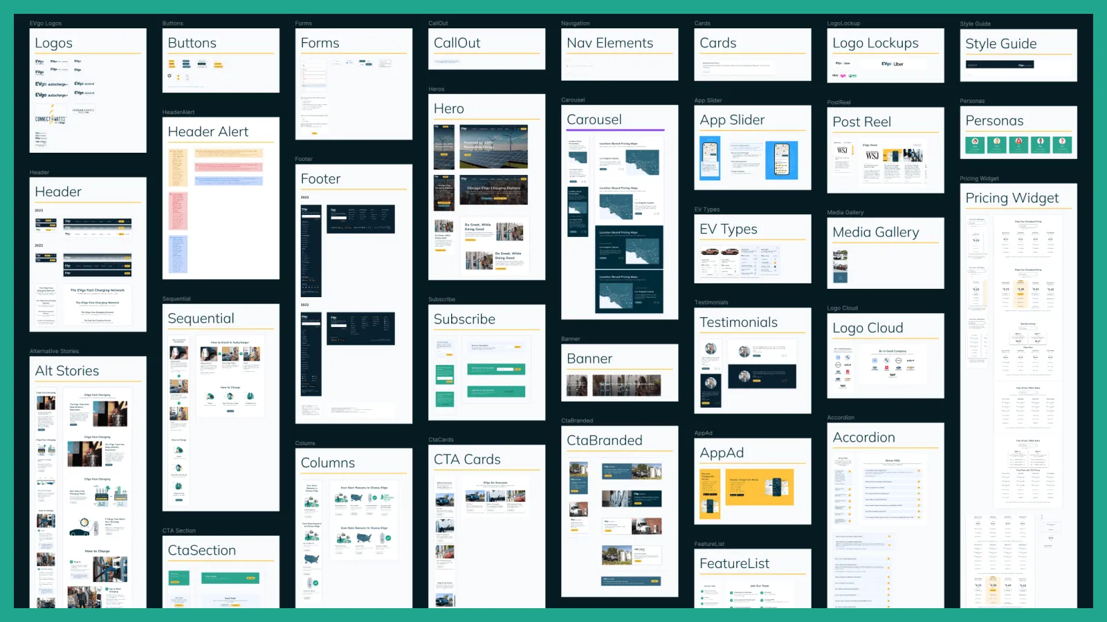
FIG. 07 — Branded Component Library
The Result
A clearer experience. Measurable growth.
- +
35% more new users
- +
30% increase in conversion
- +
20% increase in organic traffic
The redesign brought 70+ pages and 100+ components into a shared product and brand system—giving EVgo a foundation that could scale with the business.
→ Product, brand, and system – working as one.
Design leadership delivered through Tony Voorhees Studio, in partnership with AE Studio.
Design & Management
Tony Voorhees
Development
Mark Crisostomo